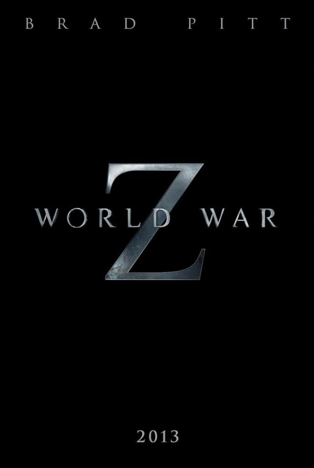
 Back in November Blurppy did an article announcing Paramount’s release of the first trailer for their upcoming summer blockbuster staring Brad Pitt called World War Z. The movie is based off the best selling book by Max Brooks and revolves around United Nations employee Gerry Lane (Pitt), who traverses the world in a race against time to stop the Zombie pandemic that is toppling armies and governments and threatening to decimate humanity itself.
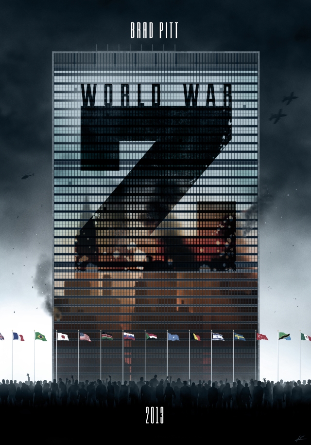
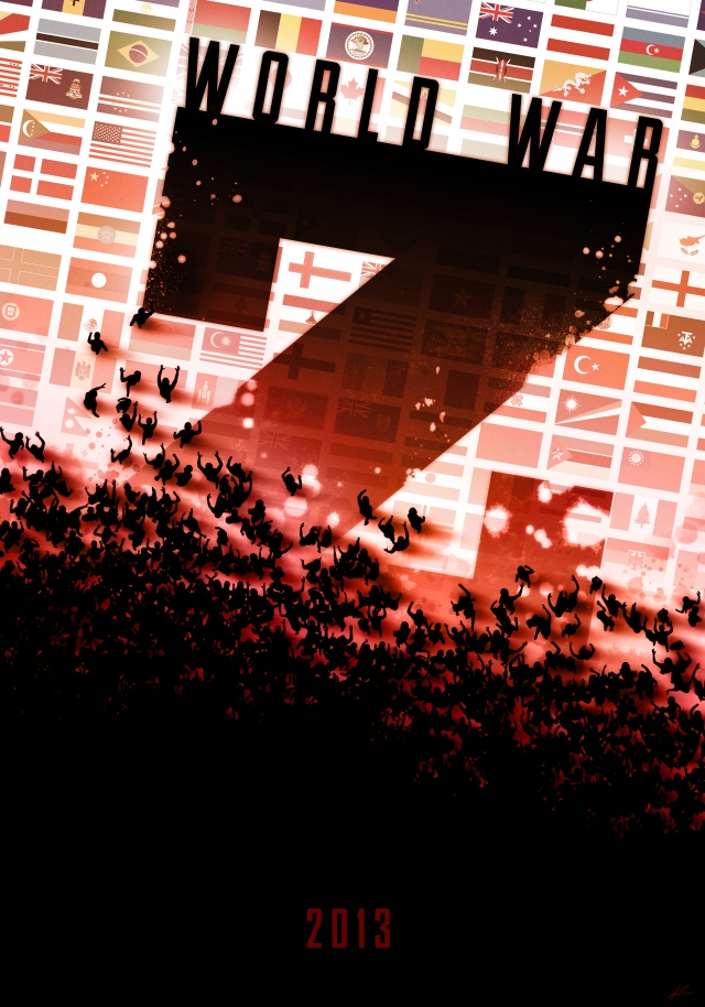
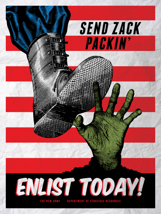
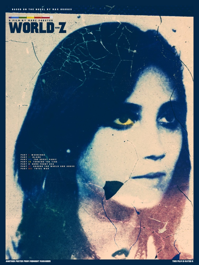
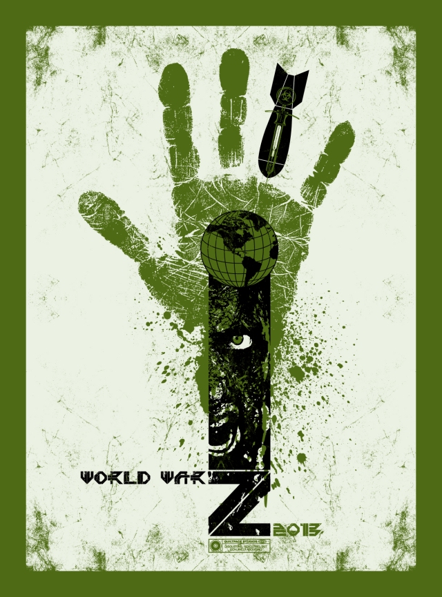
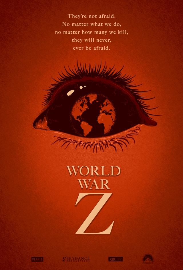
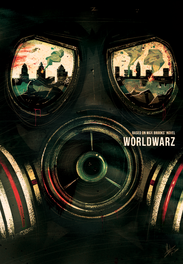
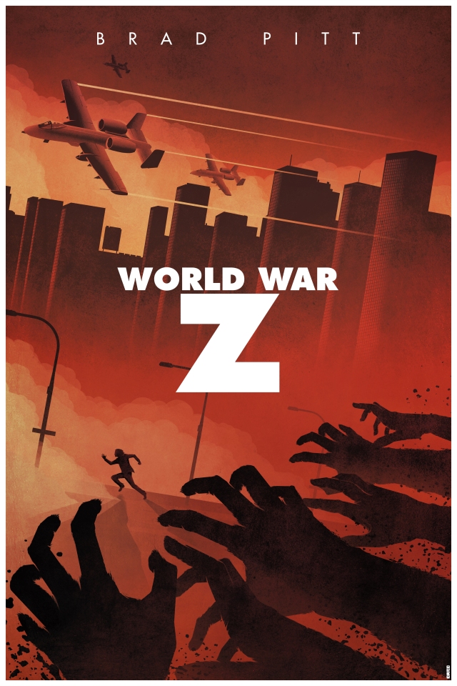
One of the things that stood out to me was the lack of a substantial poster that did the movie or the book justice. The poster, seen above, made me think that this was an opportunity for some talented creatives to interpret the movie with their own images and to try and create something special. After over 2 months, that is just what they did. The artists involved with this project have taken on the moniker “Print Posse“. (Hashtag it on Twitter, they talk a lot!) The challenge was to create an image for a movie that they had not seen yet and had limited visual assets available.
Take a look at their images and feel free to comment on Twitter using our #printposse as a way to keep the comments grouped. I want to thank the artists Tracie Ching, Midnight Marauder, Marko Manev, Chris Garofalo, Marie Bergeron, Adam Rabalais, David Moscati and Matt Ferguson for their enthusiasm and efforts, not only with the images but with the reviews and for their support of each other during the process. Each artist has delivered their own unique take on what is already one of the most anticipated movies of 2013. Below each image I have included info about the artist so that you can get more familiar with them.
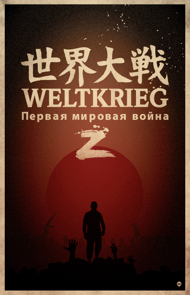
“In order it is Japanese, German and Russian and they all say their respective terms for ”World War”. Drawing from the book where its focuses on many stories all over the globe to show that the epidemic isn’t hitting in only one area and that all countries are not only infected but have equal parts to play in the stories progression.” – David Moscati
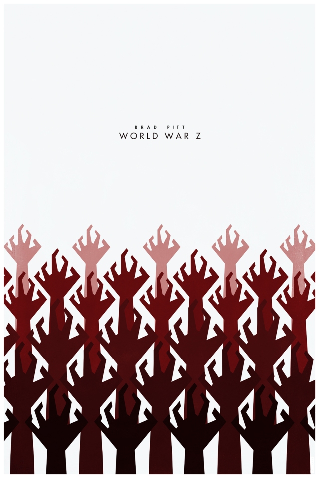
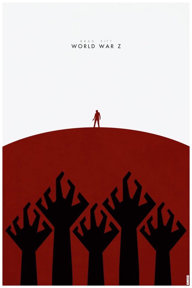
About the following companion pieces: “The concept is that they are minimalist art cards that would be a giveaway to people at the showings of the film, etc.” – Matt Ferguson
As you can see, each artist did an outstanding job. Please let us know which are your favorites down in the comments section below. I hope you enjoy these images as much as I do. I think they are all pretty impressive for different reasons.

No comments:
Post a Comment